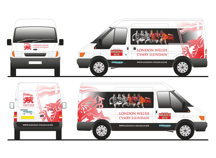
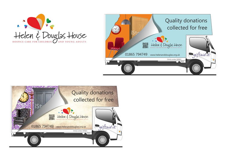
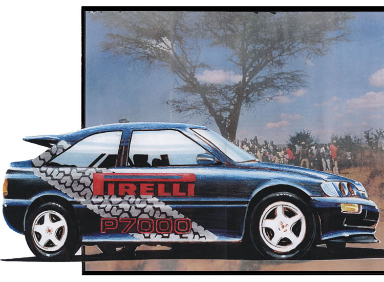
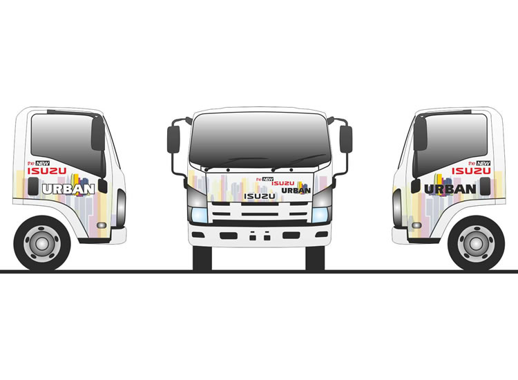
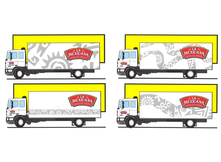
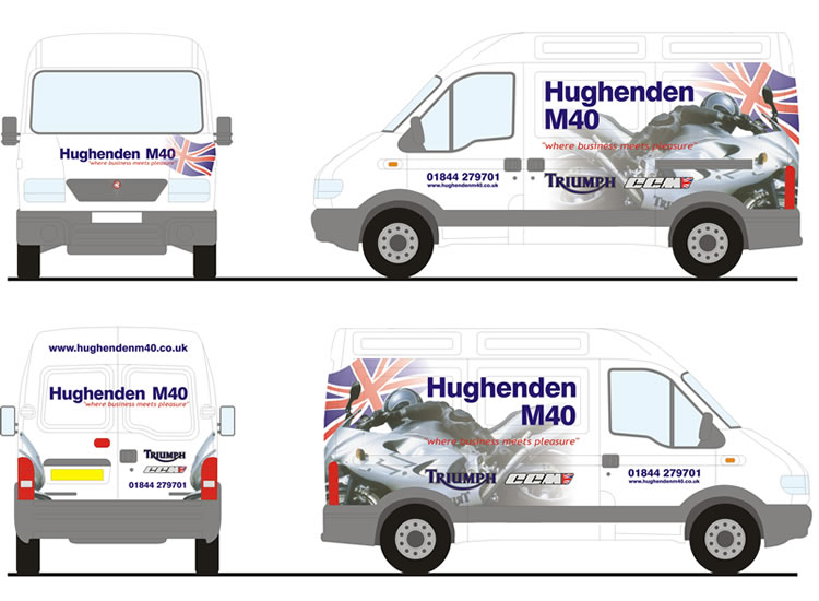
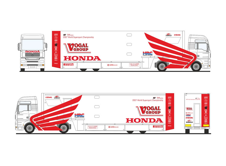
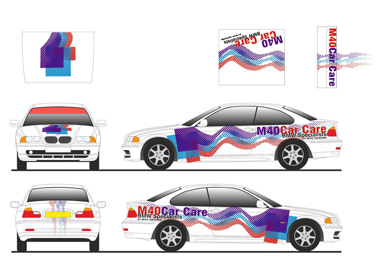
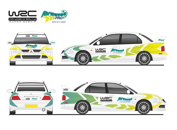
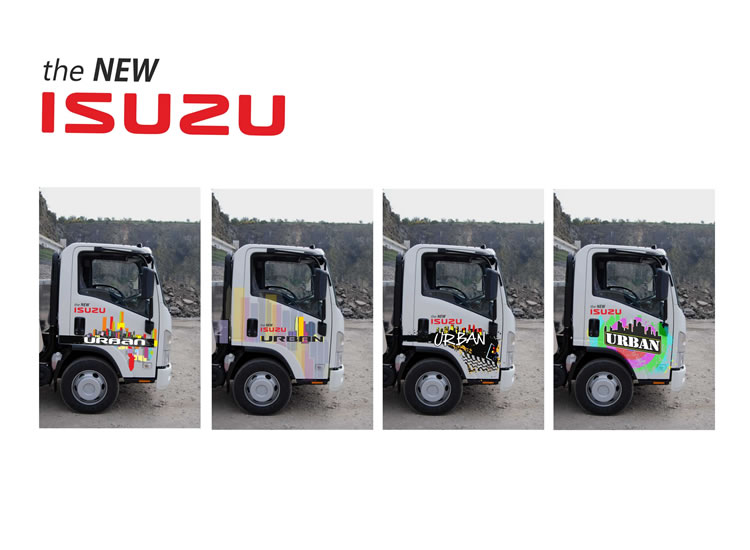
Layout is the part of livery design that deals in the arrangement of visual elements on the vehicle. It generally involves organisational principles of composition to achieve specific communication objectives via colour, size and placement.
Traditionally the most obvious layout is called the “Z” pattern. It’s the pattern of reading (in western cultures) for the strategic placement of important information. Start in the upper left corner, work across to the right, and then down and back to the left again, going top to bottom. Standard and simple.
This doesn’t always work with van graphics, well on one side at least..as a vehicle from the side is not symmetrical and so this has to be accounted for, usually on the near side where the cab is on the left. But the use of a grid system, just like a page layout in a magazine; aligning elements to each other rather than randomly scattering will help ease the flow of the eye over the surface of the vehicle.
White space too, in a composition is as important as the elements that have been placed upon it. Just as the rests in a musical score give shape to the overall comprehension and appreciation of the music, white space gives form to the layout. It is important to never ignore white space.
When arranging elements, you should consider the visual weight of each element. Weight can be determined by the size of the object, the value (dark objects weigh more than light objects, depending on the colour of the vehicle of course), and the density of the detail or texture. Balance in terms of visual contrast is also important.
Contrast typically draws the viewers eye and can be used quite effectively. Proportions and size relationships should also be considered when trying to establish balance. All objects will be evaluated in relationship to other objects.

